

The Big Story: How CMS’ decision to end a primary care program shook rural clinics
“CMS wouldn’t say how much the programs cost. But it maintained that eliminating Making Care Primary reduced spending without sacrificing its mission to improve quality of care.”
There are two sides to every graph
A 3-minute read
A few weeks ago, CMS shut down what was hoped to be an important program to support expanded primary care in rural communities. Making Care Primary was intended to give PCPs financial support for a broad range of needs — from hiring staff to transportation to appointments. This support, the theory went, would eventually lead to lower costs overall.
What stood out in coverage of the program’s sudden demise were differing comments from two CMS insiders. First, from the current spokesperson, as quoted in Modern Healthcare: “Making Care Primary ‘was not on track to meet its intended savings goal.’” Then, from a former CMS Innovation Center director: “It’s not enough time. It takes more than a year to get the numbers.”
Two people referring to the same data and reaching opposite conclusions. It’s a common occurrence — allowing our bias or perspective to push us backward into an outcome and using the data to support it.
But so is the opposite — asking the numbers to do all the work and pretending like we have no say.
I know this first-hand.
When data met human judgment
I was a cancer research lab tech in my first job out of college. Like any halfway decent scientist, my supervisor — a hard-charging assistant professor who was far more than halfway decent — loved quantitative data. In her mind, the numbers told the story.
One day, early into my two years there, she asked me to report on an experiment. I got as far as saying, “I feel like the…” before she cut me off. “This is science,” she said. “We think, not feel. Tell me what the numbers say.”
Point taken, and I understand what she was getting at. But I like having feelings. And if there wasn’t some element of art to science… well, scientists wouldn’t be genetically predisposed to, uh, let’s call it “rigorous debate.”
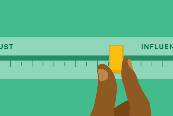
Because metrics of almost any kind — lab results or utilization stats or satisfaction scores or even charity care investment numbers — are representations of the thing, not the thing itself. Numbers are a signpost, not the destination. As such, they can be either tools or weapons. It’s the intention and the humanity (the feelings, some might say) you bring to them that pull meaning from facts… and it’s the combination that should drive your decisions and action.
At Jarrard, we collect numbers on a daily basis. Our Market Research & Insights team is on track to publish 10 surveys this year covering topics from healthcare policy to philanthropy team structures. With each one, we sit with the data, sort through it and discuss. Sometimes we even have rigorous debates about it — is it the 50% who agree or the 30% who disagree or the 20% who don’t care that matters more for the headline?
You and your team are looking at numbers every day, too. ROI from the KPIs, to say nothing about the NPS and HCAHPS. How do you not fall prey to the risk we all face from the tyranny of numbers? Here are a few dos and don’ts we feel might help.
Using data without losing perspective
- Do know why you want the numbers. A good graph is a very attractive thing. But vacuuming up data because it looks — or feels — cool and lets you say “We’re data driven” leads to confusion and distraction. Ruthlessly define the key metrics you need to get where you’re going.
- Don’t be blind to small numbers. There are people behind every fraction of a percent. If 80% agree with something, that leaves two out of every 10 who don’t. Who are they? Why do they disagree? What do they need? Don’t lose sight of their perspective, even if you make decisions based on the 80%.
- Do listen to words. Qualitative information is profoundly valuable, especially when coupled with numbers. Conversations give life and context to the hard edges of a bar chart. They convey <whispers> feelings.
- Don’t forget the whitespace. Look for places where numbers are missing. What don’t you know? Measuring an event that happens is easy. Figuring out how many times that event doesn’t happen is less so. To use an extreme example: If a hospital is suddenly at 50% capacity and revenue is down, it could be due to a catastrophic failure in reputation or marketing. Or… it could be because the hospital has done such a good job helping people lead healthier lives, they no longer need an inpatient stay. That second option lives in the whitespace and is much harder to see.
- Do remember you can find whatever you want in the numbers. So, get the right people in the room to challenge you. If that’s a struggle, ask ChatGPT, “Here’s the data and here’s my take. What are some alternatives? What are my blind spots?”
- Don’t mistake math for morals. Sometimes, the right thing goes against the numbers. ‘Nuf said.
Finding the balance between metrics and meaning
We all have biases. We all have feelings. Leaders cannot live on a diet of numbers alone any more than they can live on vibes. It’s a fine line to walk, trying not to tip too far in one direction or the other. Get it right, though, and the line will only move up and to the right.